Mini Tour (part I)
Well, as we have yet to draft out the as-built plans (cursory measurements have been taken) and schematic designs, I thought I might take you on a little web tour of our soon-to-be (O! how I tire of that prefix) house in it's 'given' state; this is as-in, before we get our hands on it. You've seen the street front in previous posts, so I shall commence with what's beyond the front door.
the Foyer
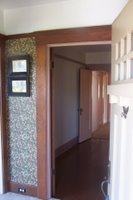 Note the classic Arts & Craft door. Note the crank door chime. Note the paint that I will have to scrape/strip off. The foyer leads into the first bedroom, as you see here and the living room on on the left. Sadly, this is the only room where the door and wall trim is NOT painted over with pink latex. This miniscule space is currently at the crux of many decisions to be made, however. One of which involves the bedroom ahead.
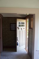 Because this room originally had no closet, one was carved out of the foyer and claimed one of the two matching sidelights (as seen from the porch). Now frankly, we're not one of those fond of having the contents of our closets viewable from a front porch window, but neither are we keen on offsetting the balance of this "first impression" entryway by clouding the windows or eliminating one.
Bedroom #1
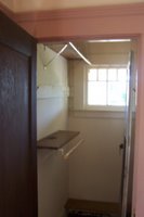
So, for option 1a, we may demo the closet and return the space to the foyer. The bedroom would then either get a more standardized closet on the opposite water wall (where the bathroom adjoins) or be delegated to use as an office/den. If we keep it as a bedroom by relocating the closet (option 1b), it would reduce the room to about 10x10. Not terribly lush, but adequate for a little one (daughter)...at least for a while. We might then see about the possibilities of cantilevering a bump-out ~2' similar to the dining room currently, restoring the size of this room.
 Btw, the floor of this room is painted, and we can only hope it is in as good a condition as the floor in the 'Master Bedroom'. So therefore a heavy prescription of stripping/scraping/sanding is in order. Also note: pink trim.
'Master Bedroom'
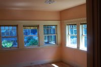 Okay, does an excess of one linear foot make a master bedroom? How about 6+ windows? Or how about building a different master bedroom altogether on the floor below...when we get a floor below. Either way, this is a rather pleasant room to behold, lots of morning light and a potential cross-breeze/gale. This room seems to need merely a refinishing, and perhaps a reworking of the closet. Said closet is rather small but much is taken by an overly deep hall
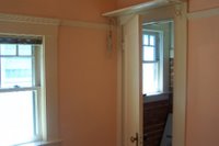 closet. We could easily claim another 2 feet here yeilding a 6' wide bedroom closet and a built-in hall linen cabinet. It's also quite deep at 2'-10"!!?! And what's with the closet window again? Is this normal? Also note: no pink trim...it's white this time.


3 Comments:
The windows in the closets are totally normal for your vintage house - I would even be willing to bet that the closet next to your front door is original - That is a pretty common setup, as these homes are not totally symmetrical on the inside.
wow. this is really beautiful. Vallejo is starting to look a lot better than oakland to me!
Another home we've seen in Berkeley had the very same layout but differed in the front closet business. I may post the pictures if I can find them. The other houses here similar to this one, tho not so sweet ;] also lack this showroom closet. I could be wrong and should know come demolition days. Now if we could just get the keys.....
and Vallejo is suprizingly cool for a city with no bookstore. It's like it's been forgotten for decades. Reminds me of Avila Beach on the Cali Central Coast. Perfect little cove and lagoon, ideal beach town, left in ignorance since the 1950's....when Diablo Nuclear Power moved in over the ridge. It's only in the past few years that any development has commenced.
Post a Comment
<< Home